GP Nagata
CASE STUDY: Sparking action through signage
CHALLENGE
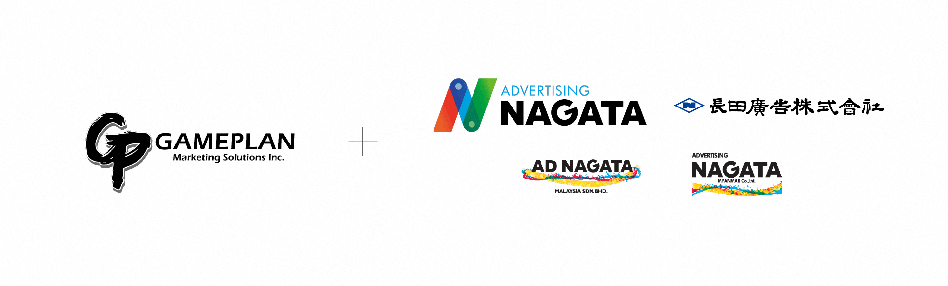
GP Nagata is a community-based advertising agency specializing in out-of-home (OOH) media. This new company was born out of the merger between two OOH agencies, Gameplan Marketing Solutions Philippines and Advertising Nagata Japan. With this joint venture it was essential to develop an identity that signified their merger while achieving a level of visibility and consistency as we build and establish our brand equity moving forward.
SOLUTION
Something about creating an Identity that unites the cultures. Using messaging that speaks about the ad space and/or importance of signage. Output -- branding and identity, messaging, signage templates/guidelines
INDUSTRY
Media
OUR ROLE
Brand Strategy
Branding & Identity
Communications
COLLABORATORS
Animation by Paolo
Nañagas
DISCOVERY PHASE
To kickoff the project, we conducted a Discovery Workshop with both the Philippine and Japanese members to gain a further understanding of the new brand. In this one-day session, we facilitated a series of activities to help understand, prioritize, and focus on a clear vision for the new merger.
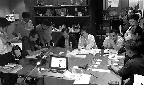
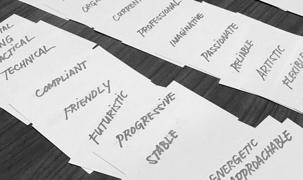
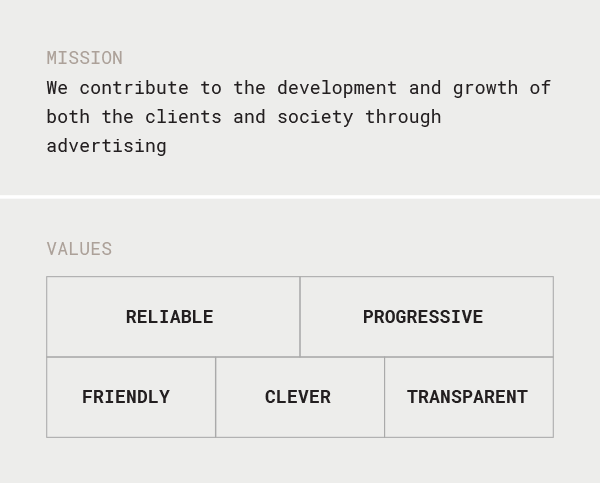
We took the findings and broke down information to build the brand strategy around it. We collaborated with the team to develop the brand values, brand essence and mission, among others, to serve as the guiding force behind the visual identity.
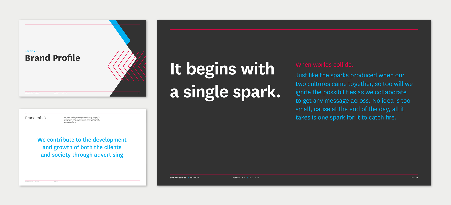
IGNITING AN IDEA
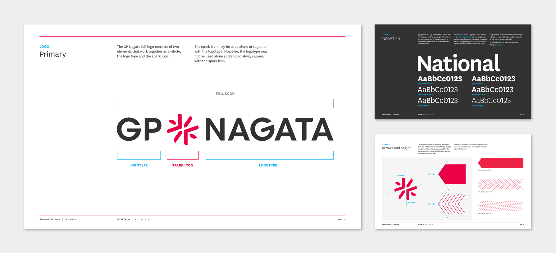
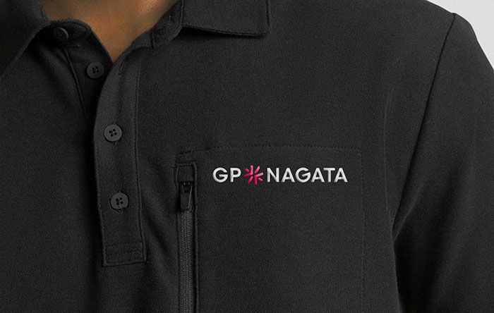
The brand mark we developed needed to achieve two main goals: represent the individual companies while maintaining a visual resemblance with the Advertising Nagata (AD Nagata) family of logos.
With that thought in mind, we used the common element of the sun in both countries’ flags and interpreted it as the spark ignited by both companies and both cultures coming together.
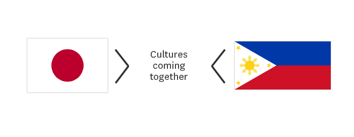
To maintain that family resemblance, we used a similar geometric typeface and the same angle as the “G” in the AD Nagata logo for the spark icon and “G” in the GP Nagata logo.
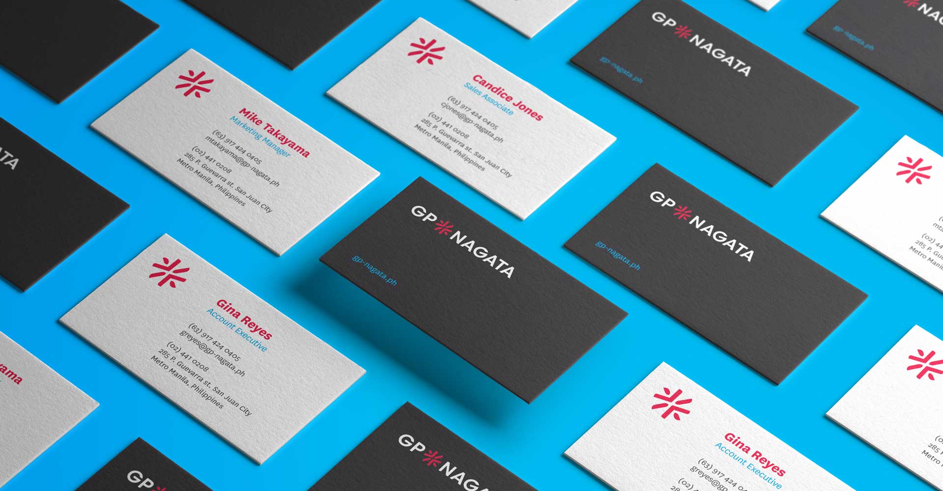
NEW BRAND
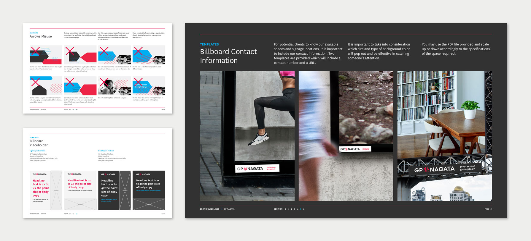
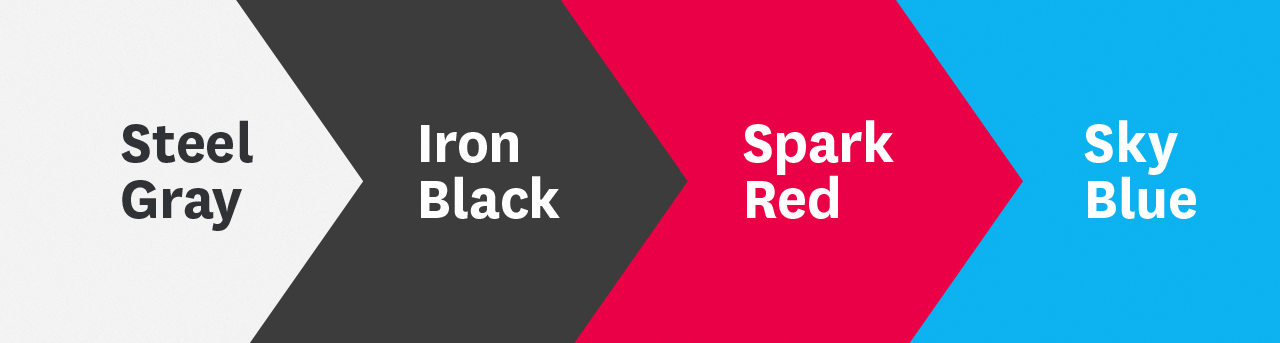
The new brand is bold and bright, using some of the colors found in the Philippine and Japanese flags. To provide a sense of energy and dynamism, arrows using the same angles in the spark icon collide with each other to represent the intersection that starts that spark.

MESSAGING
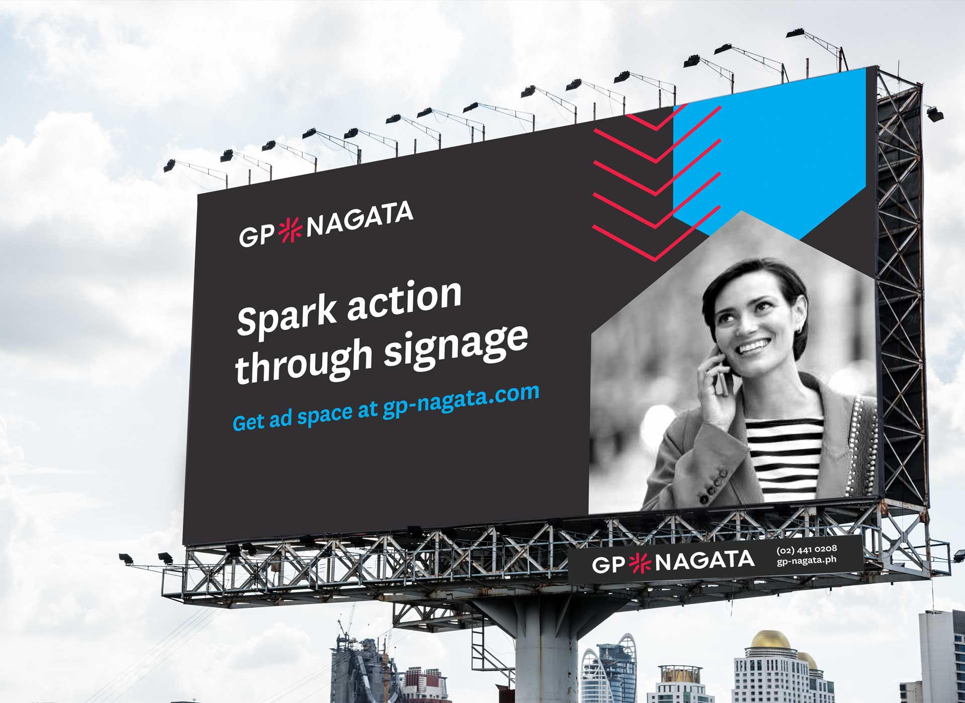
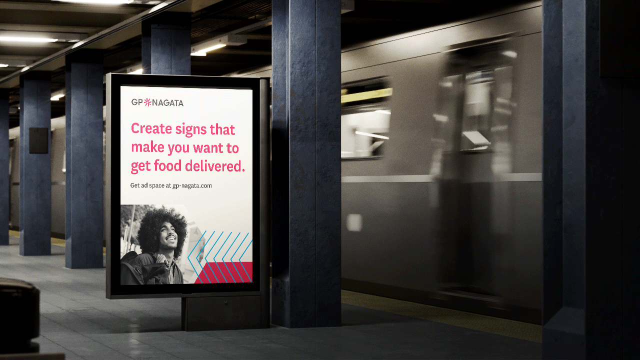
Signage is meant to elicit a reaction and as an OOH media group, it is essential for potential clients to know that the location, format, and message of your ad space matters. Some metrics of success are when consumers either purchase the product or service, increase awareness, share the information, or look for more information.
The messages in these ad spaces are meant to resonate, stimulate, question, or acknowledge meaning to its intended audience. Good signage doesn’t result in silence. Good signage sparks action.

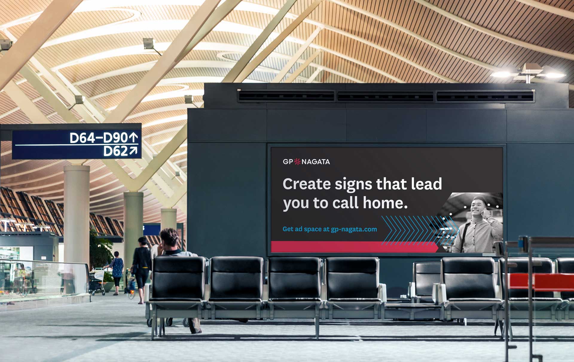
ALL TOGETHER NOW
In designing layouts for billboard placeholders, we wanted the message to capture the experience of how viewers react to the message behind the signage. We wanted it to be clear that this was selling ad space while still sending a message of how the brand is.
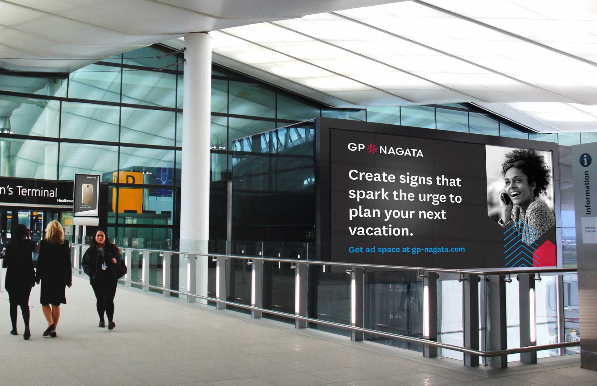
The content used in these placeholders are designed to reflect the location that the signs are in, whether at an airport terminal, a bus shelter, or inside a train station.
BRAND GUIDE
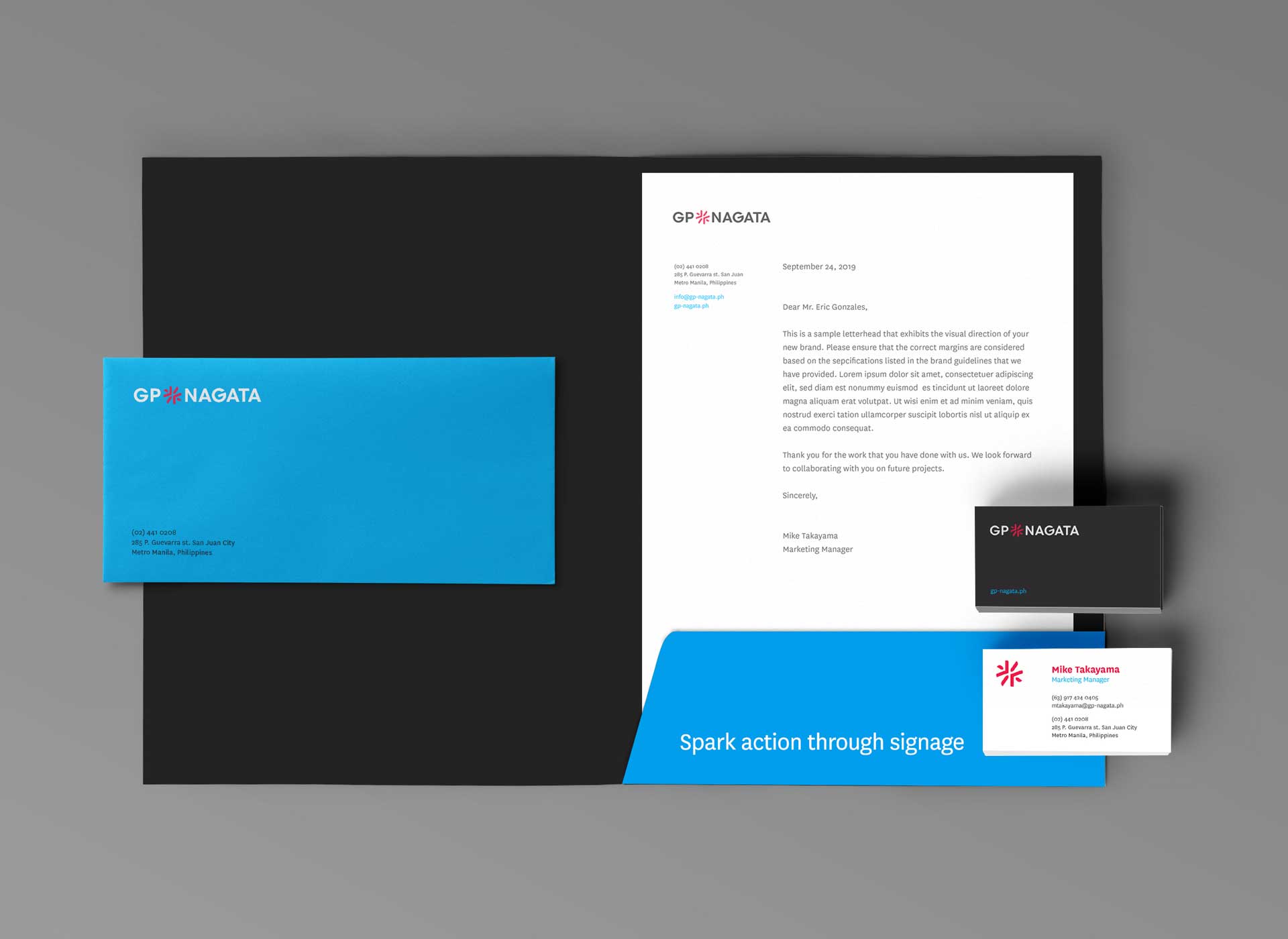
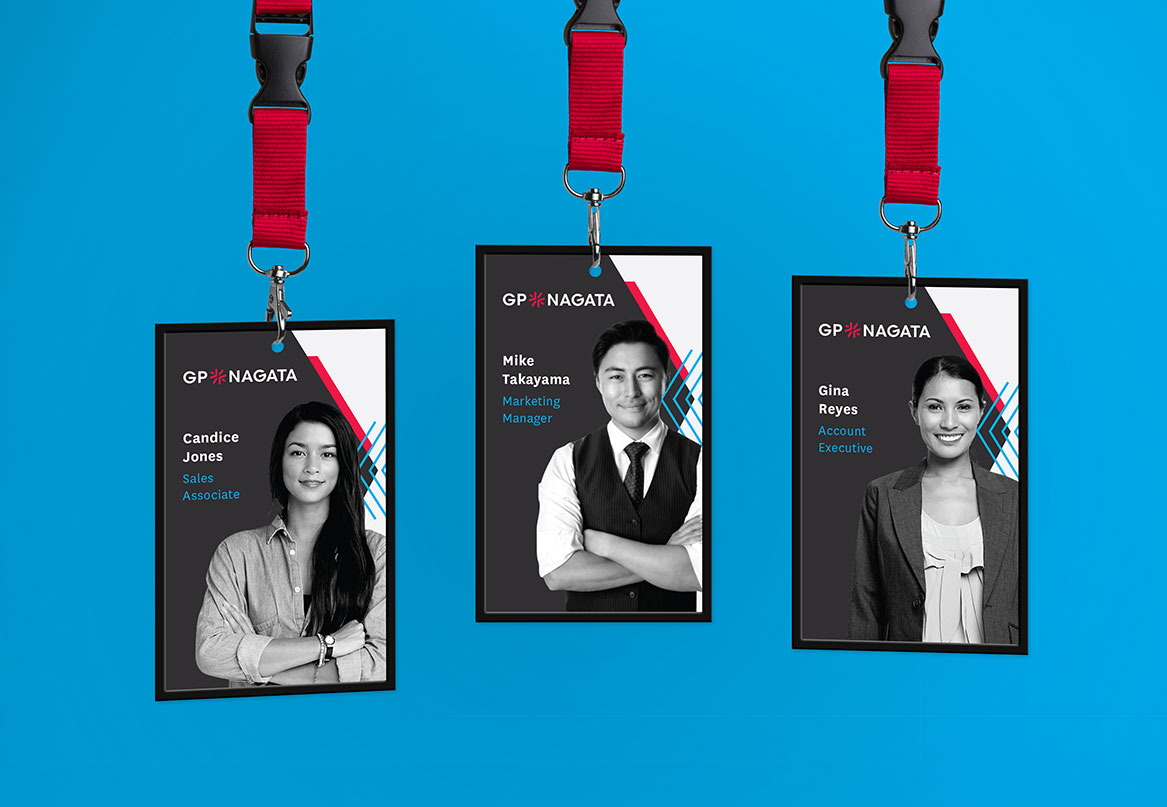
To move GP Nagata forward, we provided their creative team with materials to ensure the brand’s consistent and bold expression. We compiled the brand strategy and guidelines into a brand book and provided templates for communication materials such as presentations and signage.